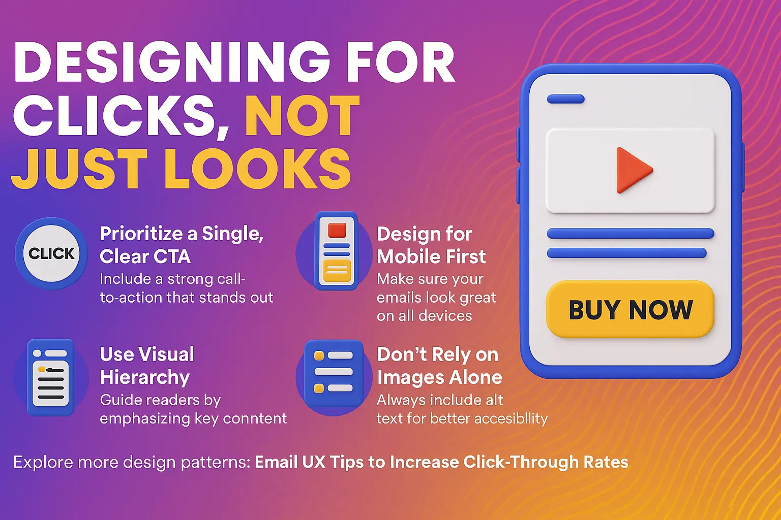

Great design grabs attention. But great design with purpose drives action — and that’s where most email campaigns fall short.
In 2025, your emails must be:
Here’s how to design for performance, not just aesthetics:
Each email should ask the reader to do one thing. If you're offering multiple actions (read, shop, download), conversions drop.
Use clear, active language:
Position your CTA above the fold and repeat it once lower in the email.
Over 70% of email opens now happen on mobile devices. If your email looks great on desktop but clunky on a phone, you’re losing ROI.
Mobile-first tips:
Most users skim. Make key information visually dominant through:
Spam filters and privacy tools (like Apple Mail) often block images by default. If your CTA or key message is only in an image, it may never be seen.
Always include:
Explore more design patterns: Email UX Tips to Increase Click-Through Rates