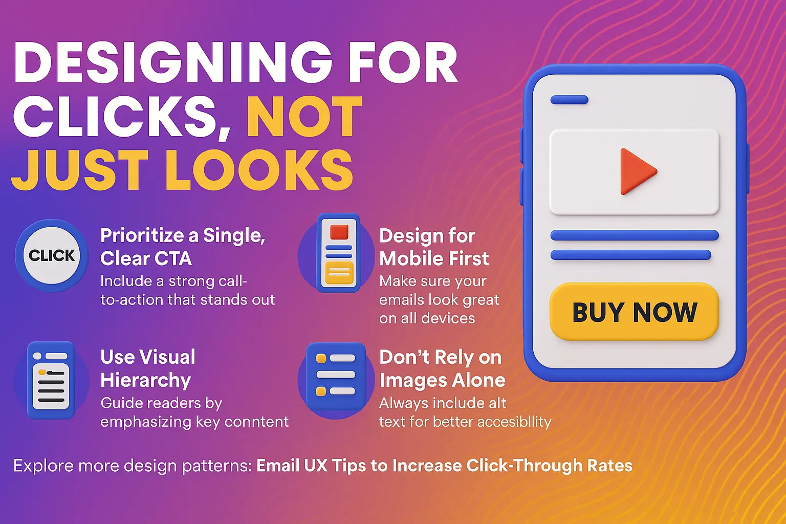
Designing for clicks, not just looks. Discover how mobile-first layouts, visual hierarchy, and single-CTA focus are transforming email UX in 2025.
Design principles that turn opens into meaningful actions
Great email design isn’t about aesthetics — it’s about guiding the reader to action. In 2025, with attention spans shorter and inbox competition fiercer, every element of your email UX must be intentional, responsive, and conversion-optimized.
This guide breaks down the core UX tactics that consistently drive higher click-through rates (CTR) across campaigns.
1. Design Mobile-First, Always
Over 70% of email opens now happen on mobile. If your email isn’t optimized for small screens, you’re losing users before they even read the CTA.
Best practices:
Use a single-column layout
Keep font size readable (minimum 16px)
Use large tap targets (minimum 44x44px for buttons)
Avoid image-only emails that may not load by default
2. Prioritize the Primary CTA
Every email should have one core goal. Don’t make users guess.
Tips:
Place CTA above the fold, with strong contrast
Use active verbs (“Start your free trial,” “View the collection”)
Reiterate the CTA at least once — ideally near the bottom
Make sure buttons have descriptive alt text
3. Use Visual Hierarchy for Skimmability
Most users skim, not read. Guide their eye by structuring content for clarity.
Optional deep-dive (like blog or video link) at the bottom
This keeps your design clean without sacrificing depth.
5. Avoid Cognitive Overload
More options often means less action. Clean, minimal emails tend to outperform busy ones.
Reduce:
Link clutter — one CTA is better than five
Overlapping visuals — avoid stock photo overload
Dense copy — remove every word that doesn’t serve the goal
6. Accessibility Boosts Engagement
Accessible emails aren’t just ethical — they perform better.
Make sure to:
Use high color contrast
Include descriptive alt text for images and buttons
Avoid low-contrast “ghost buttons”
Write clear subject lines and preview text for screen readers
7. Test and Iterate
Every audience is different — even these best practices are starting points.
Test:
Button size, color, and placement
Text link vs. visual CTA
Image formats and load speed
Section order (e.g., value before brand or vice versa)
Tool Suggestions
Litmus: Render testing across devices
Figma or Canva: Design templates
Email on Acid: Accessibility and inbox previews
HubSpot / Klaviyo: Built-in responsive editors with UX blocks
Final Word
Email UX is where copy, design, and intent converge. The more intuitive your experience, the more likely users are to take action — and return for more.