The Psychology of High-Converting Websites: Why Visitors Buy (or Bounce)

Your website isn’t your business card.
It’s your digital sales rep — and every visitor decides in seconds whether they’re going to shake its hand or slam the door.

The scary part? Most sites lose the sale before the visitor even scrolls. Not because the product’s bad. Not because the service isn’t worth it. But because the site fails the human brain test.

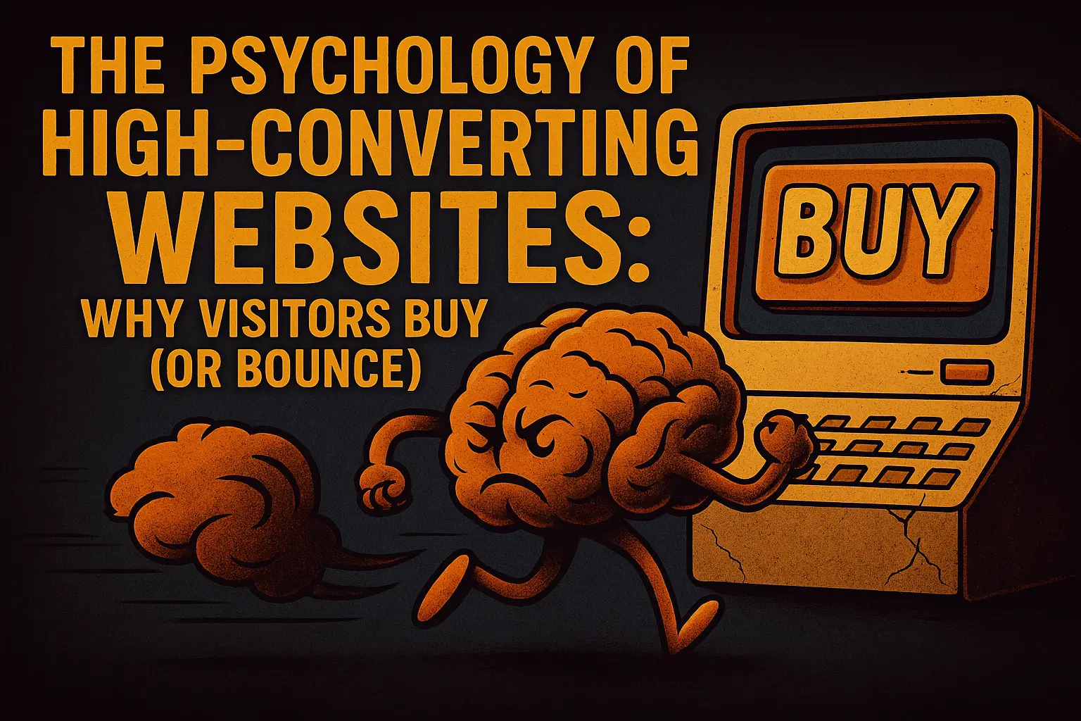
This is where conversion psychology comes in. Let’s pull back the curtain on why people click “Buy” — and why they ghost you instead.

1. First Impressions: The 50-Millisecond Verdict

Studies show people form an opinion about your site in 0.05 seconds. That’s less time than it takes to read this sentence.

What your visitors’ brains are asking:

  • “Is this legit?” (Trust cues)
  • “Is this relevant to me?” (Relevance)
  • “Do I feel comfortable here?” (Ease)

What to do:

  • Use a clear headline that says what you do and why it matters — instantly.
  • Keep design clean. Your site isn’t a flea market; your visitors shouldn’t have to dig through chaos to find what they want.
  • Show a trust signal immediately (testimonials, awards, partnerships).

2. The “What’s In It For Me?” Law

No one wakes up thinking, “I can’t wait to read a features list.”

They’re asking, “What problem are you solving for me, and why should I trust you to do it?”

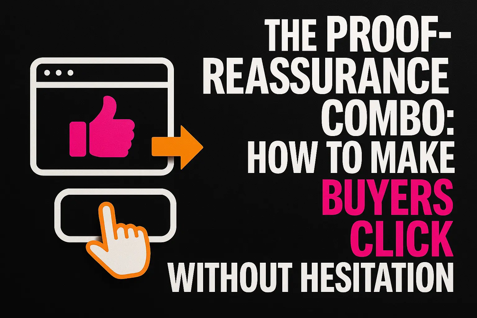
Psychology trigger: Value framing. The human brain filters every decision through perceived reward vs. perceived risk.

What to do:

  • Lead with outcomes, not features: “Cut your customer onboarding time in half” beats “Advanced workflow automation tools.”
  • Back it with proof — numbers, case studies, real screenshots (not stock smiles).

3. Social Proof: Because Nobody Wants to Be the Guinea Pig

Humans follow the crowd when uncertain. If your page feels empty of real-world validation, you’re asking your visitors to take a blind leap.

What to do:

  • Place testimonials, reviews, and case studies near decision points.
  • Show customer counts, results, or recognizable logos (if you have them).
  • Use specific wins: “Increased revenue by 243% in 6 months” beats “helped grow sales.”

4. The Paradox of Choice

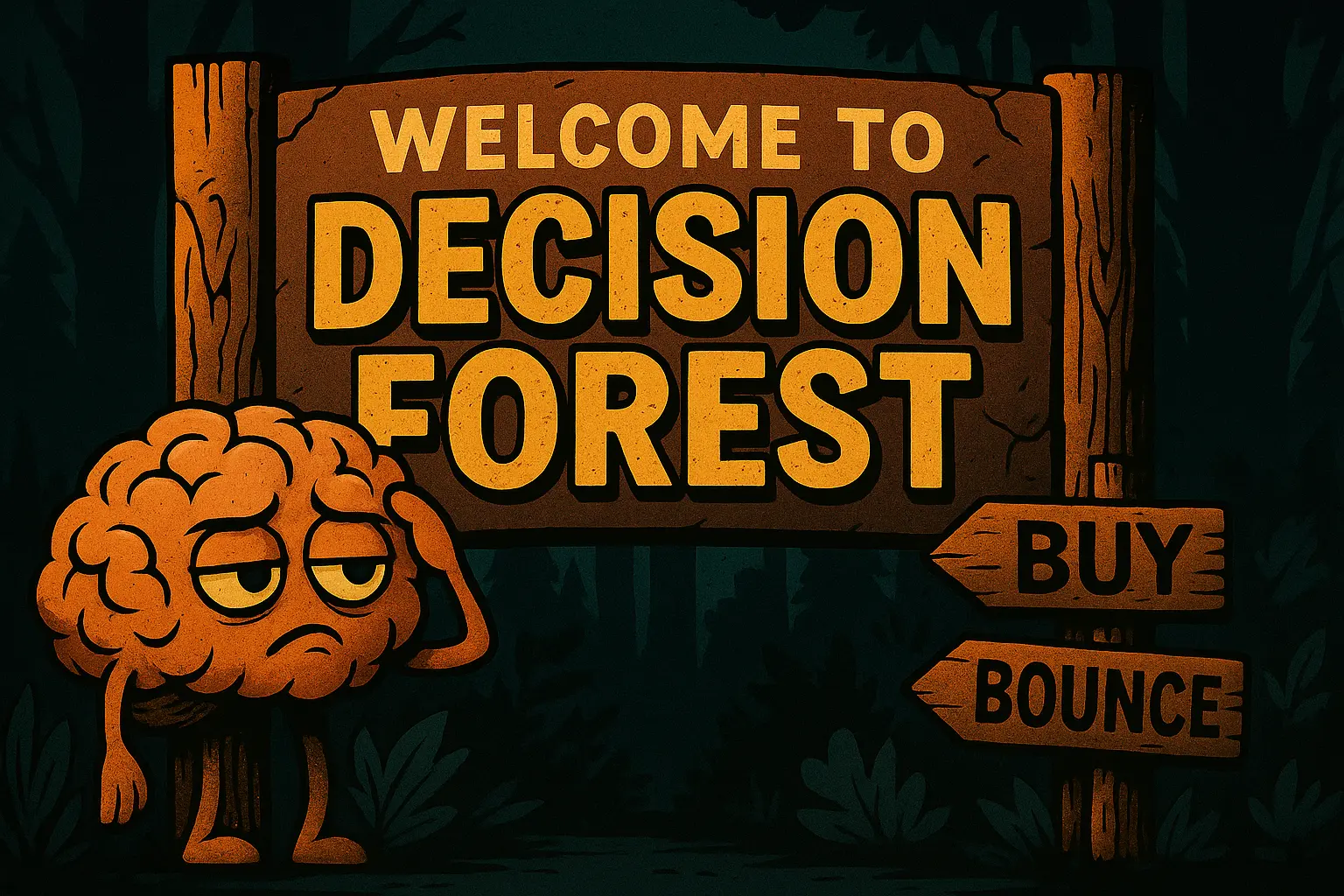
Offer too many options and visitors freeze — a cognitive bias known as choice paralysis.

What to do:

  • Limit CTAs to one primary action per page.
  • If you have multiple offers, use a clear hierarchy: one “main” choice, others secondary.
  • Make buttons look clickable (yes, this still trips up designers).

5. Loss Aversion: The Secret Sauce for Action

People are twice as motivated to avoid loss as they are to gain something.

What to do:

  • Frame offers in terms of what they’ll miss out on if they don’t act:
    • “Stop losing sales to slow load times”
    • “Don’t waste another month on low-quality leads”
  • Pair urgency with credibility — fake countdown timers scream scam.

6. The CTA Psychology Test

Your Call to Action isn’t just a button. It’s the moment you’re asking for trust.

What to do:

  • Use first-person phrasing: “Get My Free Audit” converts better than “Get a Free Audit.”
  • Make it visible without scrolling.
  • Repeat it after every major section — people don’t scroll back up.

7. The Post-Click Experience

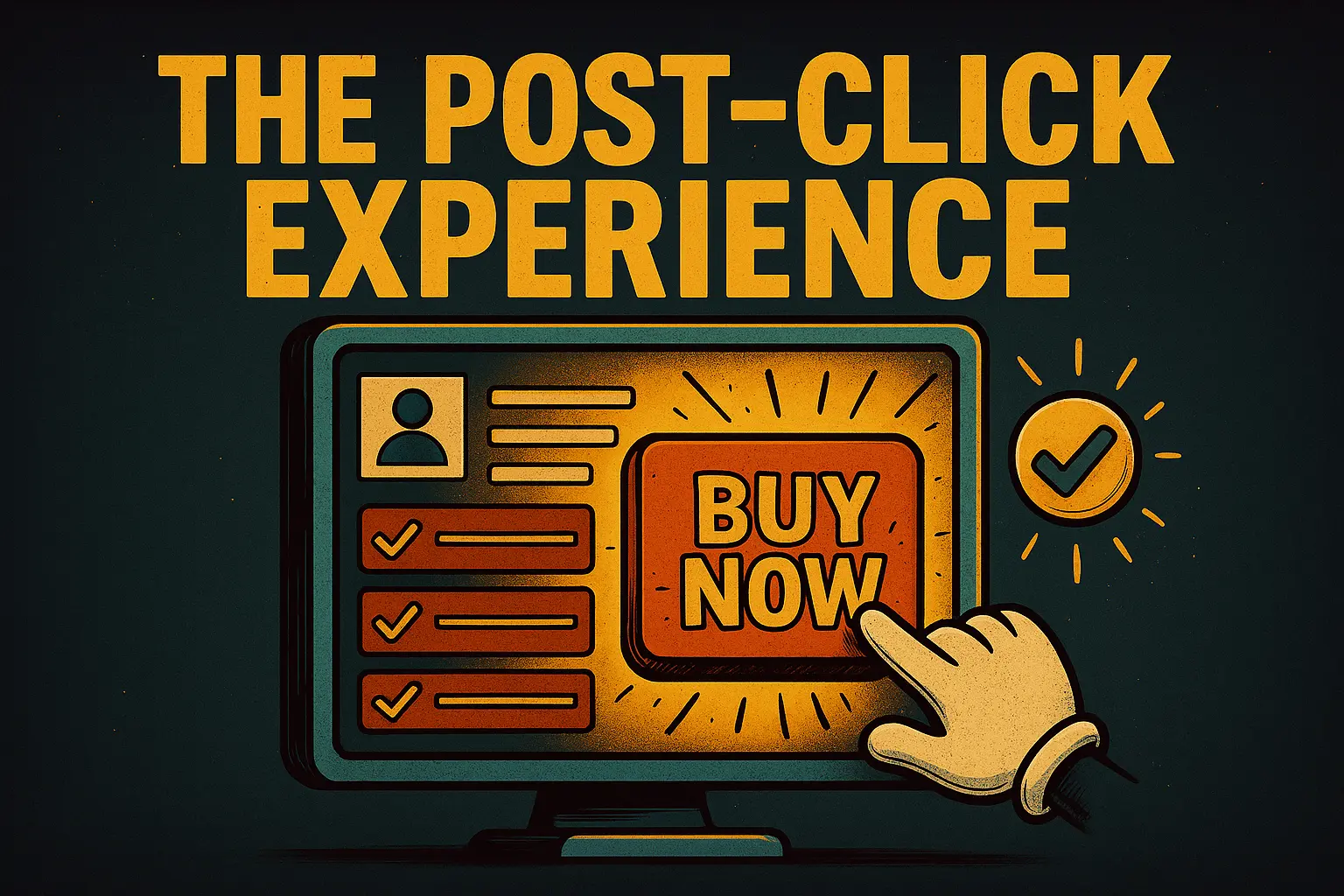
Congratulations, they clicked! Now don’t blow it.

A conversion is only complete if the post-click experience matches the promise.

What to do:

  • If you promise a free guide, the landing page should deliver instantly, not bury them in more forms.
  • Confirmation pages should reinforce trust and outline next steps.

Your Takeaway (And a Slight Gut Punch)

If your site gets traffic but no sales, it’s not a traffic problem — it’s a human decision-making problem.
Optimize for how people actually think, not how you wish they behaved.

Because in the end:

Visitors don’t convert because you have a great product. They convert because your site made them feel like buying it was the smart move.

You Might Also Like

CONTACT
info@digitalmarketingalive.com
(307) 488-7620

HAVE A QUESTION? SEND US A MESSAGE